So you’ve created an eye-catching email and sent it to a targeted list of customers. But your job isn’t done quite yet.
How do you know if your email campaign was a success? Is it delivering the required results? Was it even delivered to the inbox?
The answers to all these questions lie in consistently tracking campaign performance.
We know it can be difficult to continually track email analytics; we get it; it’s time-consuming! This is exactly why Sendlane’s newly updated Campaign Reporting was created with that in mind. Track your email performance at a glance to see what’s working and what’s not.
The Campaign Reports let you measure various metrics related to:
- Behavior
- Engagement
- Revenue
- Link tracking
- Domains and devices
In this post, we’ll walk you through each category by explaining what metrics you can track, what they tell you about your emails, and how you can leverage them to your benefit.
Let’s get started!
What metrics can you track in your Sendlane campaign reports?
Once you’ve completed an email campaign using Sendlane, you’ll be able to view a detailed report for it.
To access a campaign report, navigate to the left sidebar in your Sendlane dashboard, and click on Campaigns.
Find the campaign you want to analyze results for, and click on View Report next to it.
On the screen that pops up, you’ll be able to view performance-related metrics for your email campaign divided into 5 sections.
Here’s a detailed explanation of what each section tells you and how your eCommerce business can make the most of it.
1. Behavior
The first section of your campaign report shows you metrics related to your contacts’ behavior — in other words, how they interact with your emails.
Here are the metrics you can view under this section:
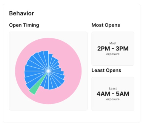
- Open Timings: This chart visualizes how many opens your email got on average at each hour of the day. Think of it as a 24-hour clock, where each slice represents one hour.
- Most Opens: This metric shows you the exact time slot when your email got opened the most. This time slot is highlighted in the chart as a green-colored slice.
- Least Opens: This metric shows you the exact time slot when your email got the least exposure or opens. This displays in the chart as the smallest slice.
As an eCommerce brand, you can use behavioral data to improve the timings of your future email campaigns. For example, if your contacts are most active between 5 PM - 6 PM, that might be the best time to send out your emails.
2. Engagement
This is one of the most important sections of your campaign report. Here, you’ll view metrics related to your email’s overall performance — from clicks and opens to revenue and deliverability.
Here’s a deep dive into what these metrics can tell you:
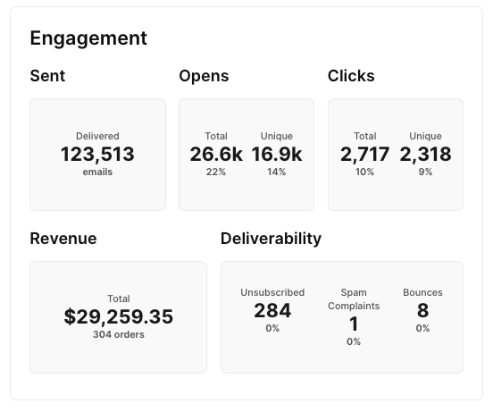
- Sent: This metric shows you how many emails were delivered as part of your campaign. A clean, healthy email list would drive this number up, while a list full of invalid or outdated contacts would result in a low number of sent emails.
- Opens: This metric shows you the total number of times your email was opened and the number of unique opens for that email. Compare this with the Sent metric to get a better idea of how engaged your contacts are. This information is also displayed as a percentage below to make it easier to analyze.
- Clicks: Just because a contact opened your email doesn’t necessarily mean they engaged with it. This metric shows you the total and unique number of clicks on your email to better understand how many people engaged with the content.
- Revenue: For eCommerce businesses, this metric shows how much revenue this particular email campaign earned for your business. You can also view the total number of orders that came in through this email.
- Deliverability: Here, you can see whether your contacts want to hear from you or not by looking at metrics related to spam complaints and unsubscribes. If you have many people unsubscribing from your list, you might want to revisit your campaigns and make sure they’re not spammy, irrelevant, or annoying.
You can also view the total number of email bounces here, which shows you whether you have a healthy list of engaged contacts or one full of inactive or outdated email addresses.
Understanding your engagement metrics will help you create better emails in the future that get opened and clicked more often and bring in more revenue.
//[inject:ad-demo]
3. Revenue
Further down your dashboard, you’ll find the Revenue section. Here, you can find a summary of how much money your email brought in, as well as a list of the top products that were sold as part of your campaign.
Here’s a breakdown of what you can view here:
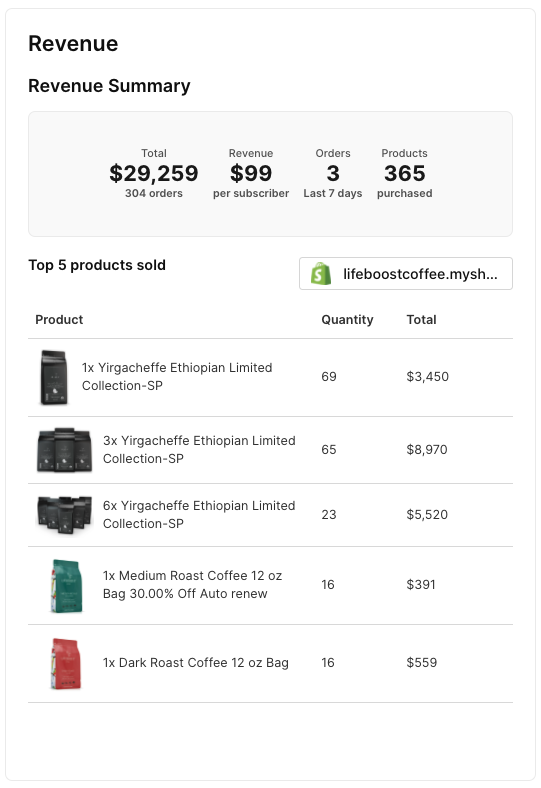
- Revenue Summary: Here, you can view the total number of orders, the average revenue generated per subscriber, the number of orders received over the last 7 days, and the total number of products purchased through this email campaign.
- Top 5 Products Sold: This metric shows you a breakdown of the top products sold through a particular email campaign. You can also view the quantities of each product, along with the total revenue earned.
This is a crucial section for most eCommerce brands, as it shows how a particular email campaign contributed to the profitability of the business.
You can use this information to create emails that promote the right products and drive purchases instead of just getting opens and clicks.
4. Tracking
The link tracking section tracks the links inside your email campaigns and analyzes how well each link is performing.
You’ll also be able to view the total and unique number of website views you received through an email campaign, as well as a breakdown of the website URLs.
Here’s a snapshot of the Tracking section:
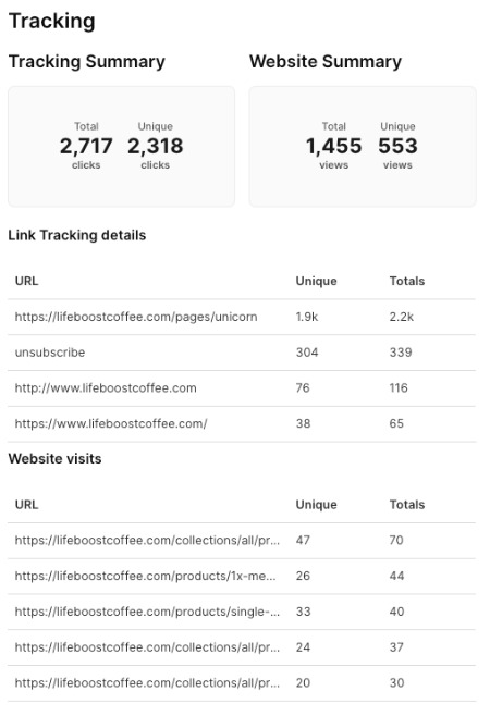
- Tracking Summary: Here, you can view the total and unique number of clicks the links inside your email campaign received.
- Website Summary: Track the total and unique number of views your website received through an email campaign.
- Link Tracking Details: This part lists five URLs inside your email that received the highest number of total and unique clicks.
- Website Visits: View the five website URLs that received the highest number of total and unique views through your email campaign.
As an eCommerce business, you can use the information in this section to analyze each link inside your campaign in detail. This will help you understand which links are getting the most clicks and which website URLs drive the most traffic.
5. Domains & devices
The last section of your campaign report shows a complete breakdown of the domains and devices most commonly used by your contacts to access your emails.
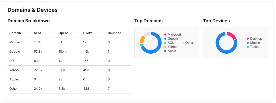
- Domain Breakdown: Sendlane measures exactly how many emails have been sent, opened, clicked, or bounced for each of the domains used by your contacts.
- Top Domains: In this section, you’ll see a colorful donut chart that visualizes your contacts’ top domains.
- Top Devices: This chart visualizes the top devices used by your contacts to access your email, such as desktop, mobile, and tablet.
Your business can use this information to create optimized email campaigns for the most commonly used domains and devices. This will not only improve the way your emails look but also boost engagement and conversions.
For example, suppose most of your emails are accessed via mobile. In that case, it's a good idea to keep your emails short and sweet, use smaller and fewer images, and responsive email design and prominent calls-to-action that users are less likely to miss while scrolling.
Boost email opens, clicks, and conversions with Sendlane’s campaign reporting
Sendlane’s campaign reporting makes it easy to dive deep into how well your campaigns perform. This helps you make strategic decisions to optimize your emails for future campaigns that will generate even more engagement and conversion.
Ready to send engaging emails with measurable results? Create a Sendlane account today and take it for a 14-day free test drive!


%20(1).avif)


%20(1).avif)
%20(1).png)
.avif)


.avif)
.avif)


.avif)


.avif)


.avif)


.avif)


.avif)

.avif)
.avif)

.avif)
.avif)

.avif)

.avif)


.avif)
.avif)
%20(1).avif)
.avif)


.avif)


.avif)
.avif)

%20(1).avif)

%20(1).avif)


.avif)


.avif)


.avif)


.avif)


.avif)


.avif)

.avif)

.avif)
.avif)


.avif)


.avif)

.avif)


.avif)


.avif)


.avif)


.avif)

.avif)

.avif)
.avif)

.avif)
.avif)

.avif)

.avif)

.avif)


.avif)


